In Use
Onni speaks every language. Watch the weight breathe.
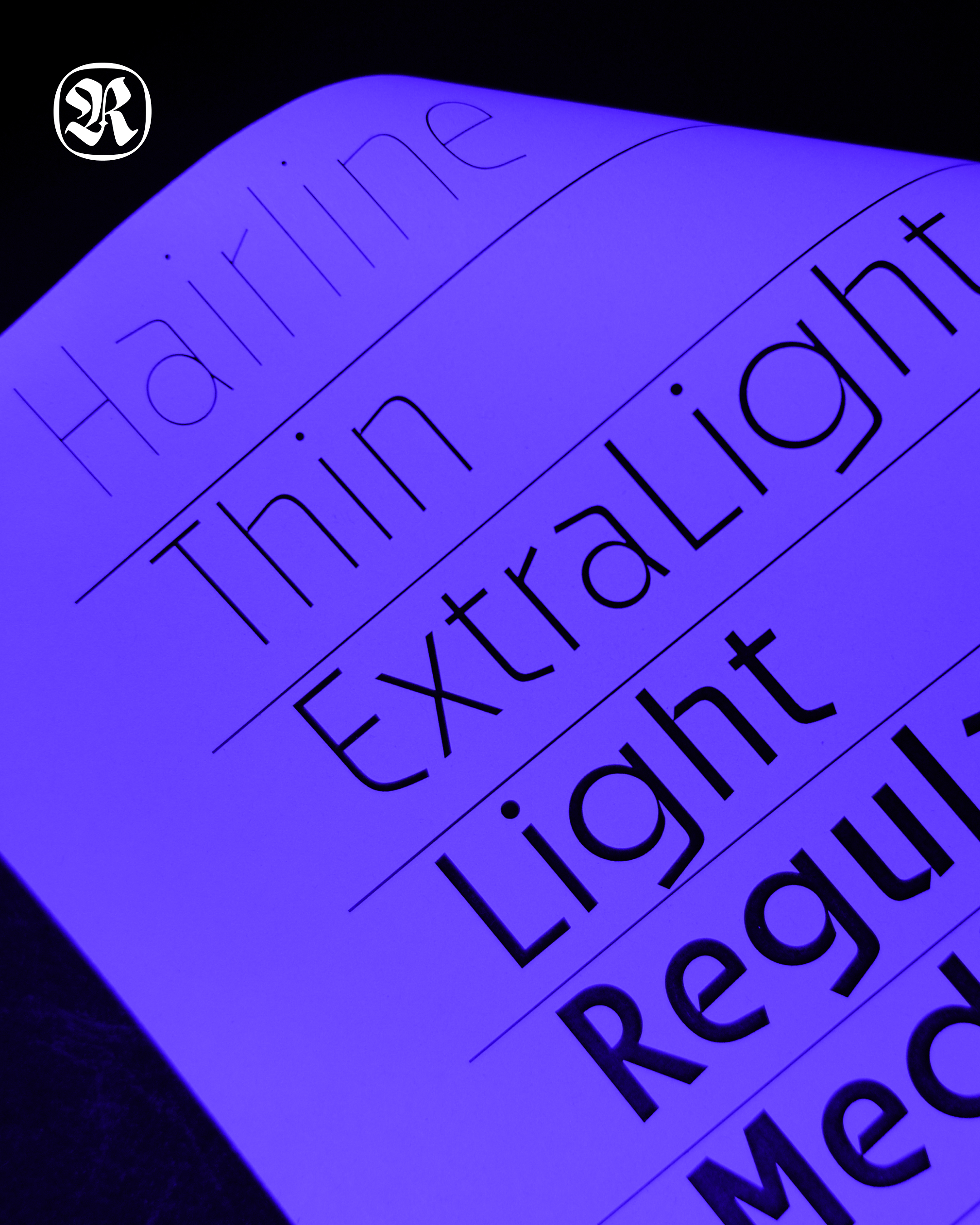
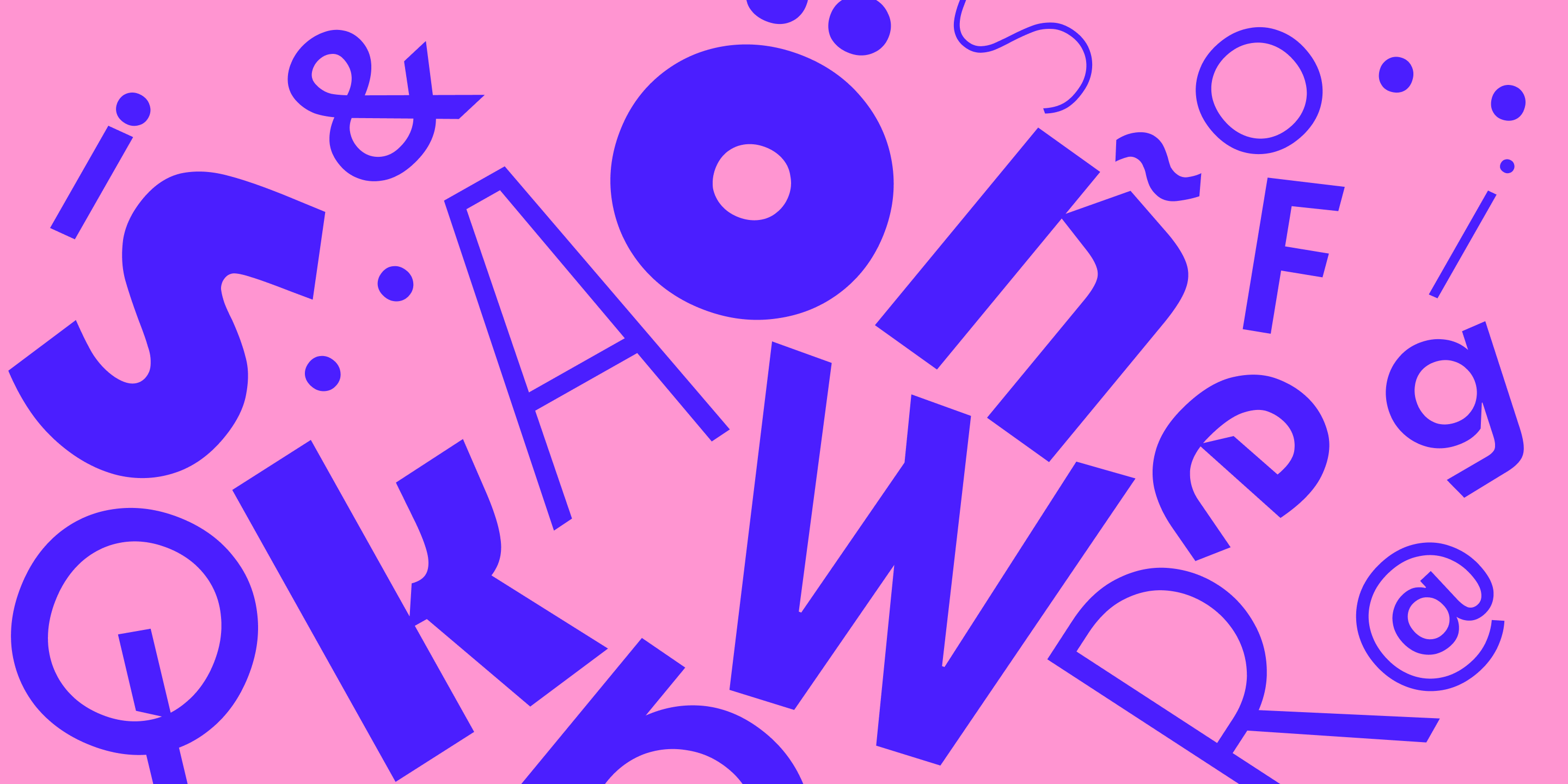
Onni is a Finnish word meaning happiness, luck, and fortune. Rooted in geometric precision yet warm in spirit, it carries the quiet confidence of Nordic design — minimal, purposeful, and built to last. From Hairline to Black, every weight holds the same geometric integrity.
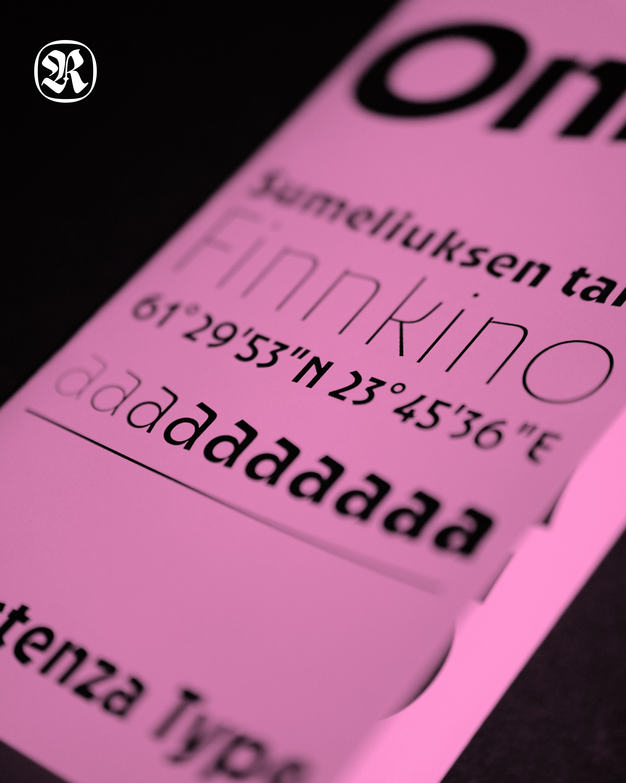
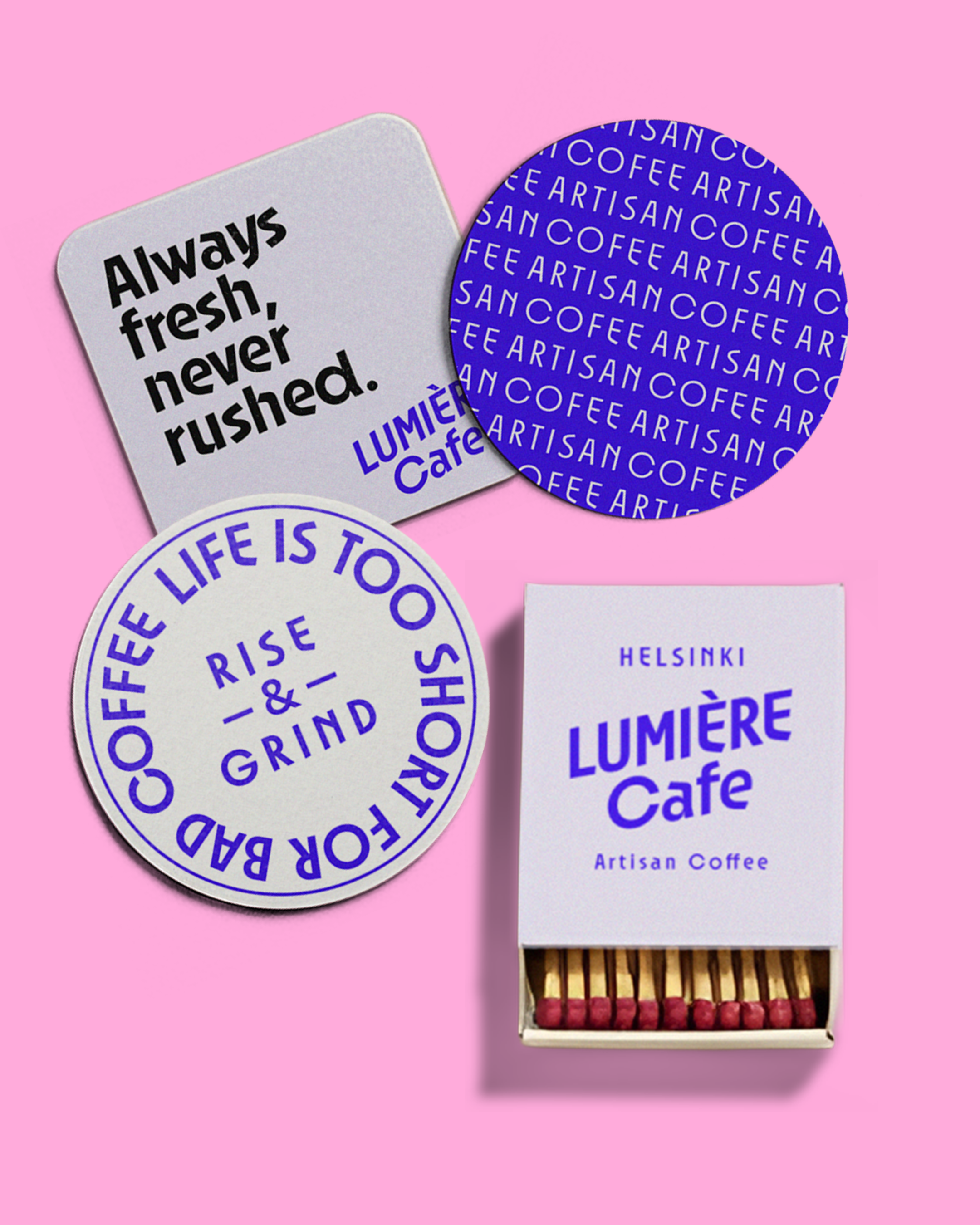
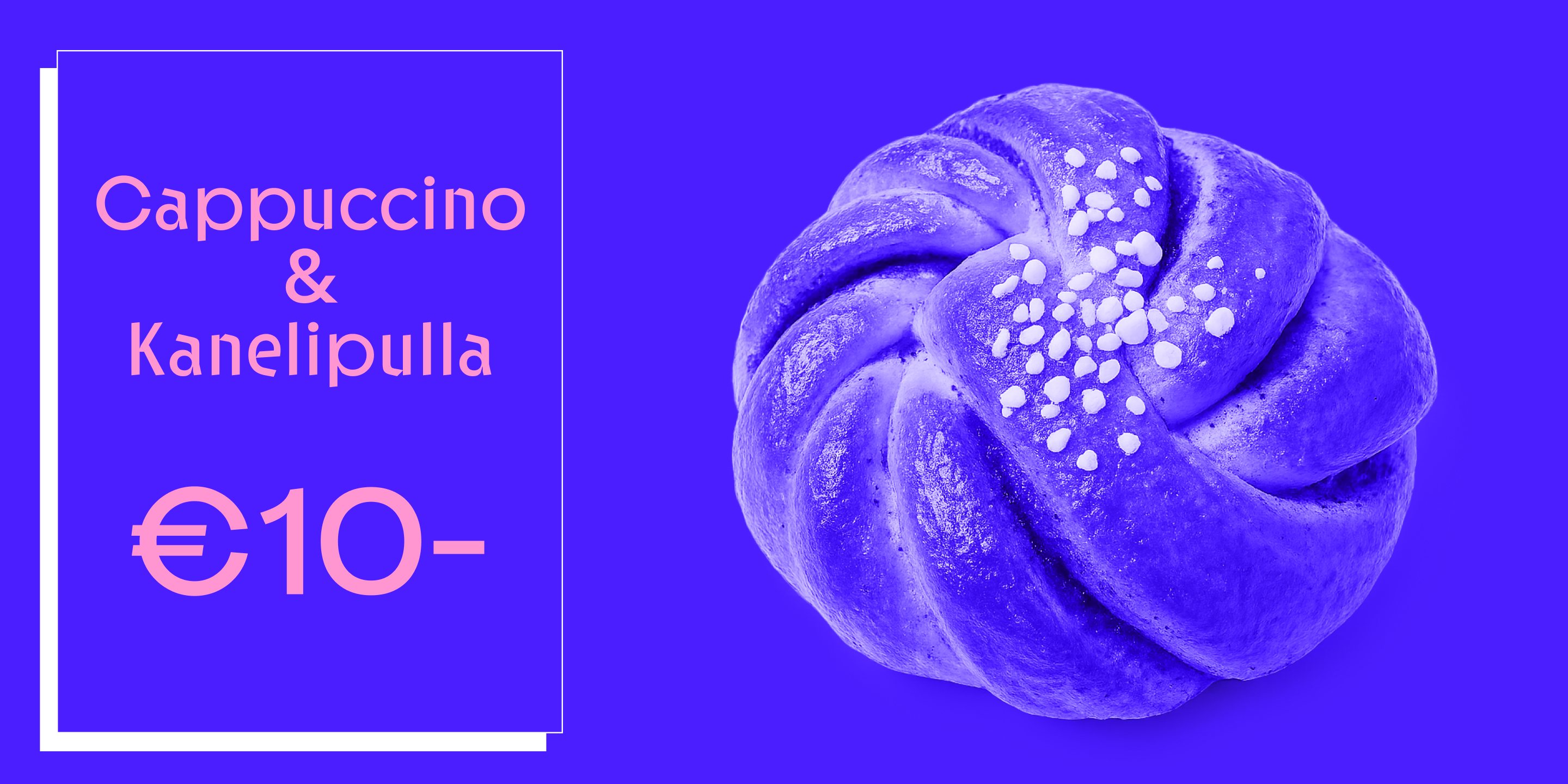
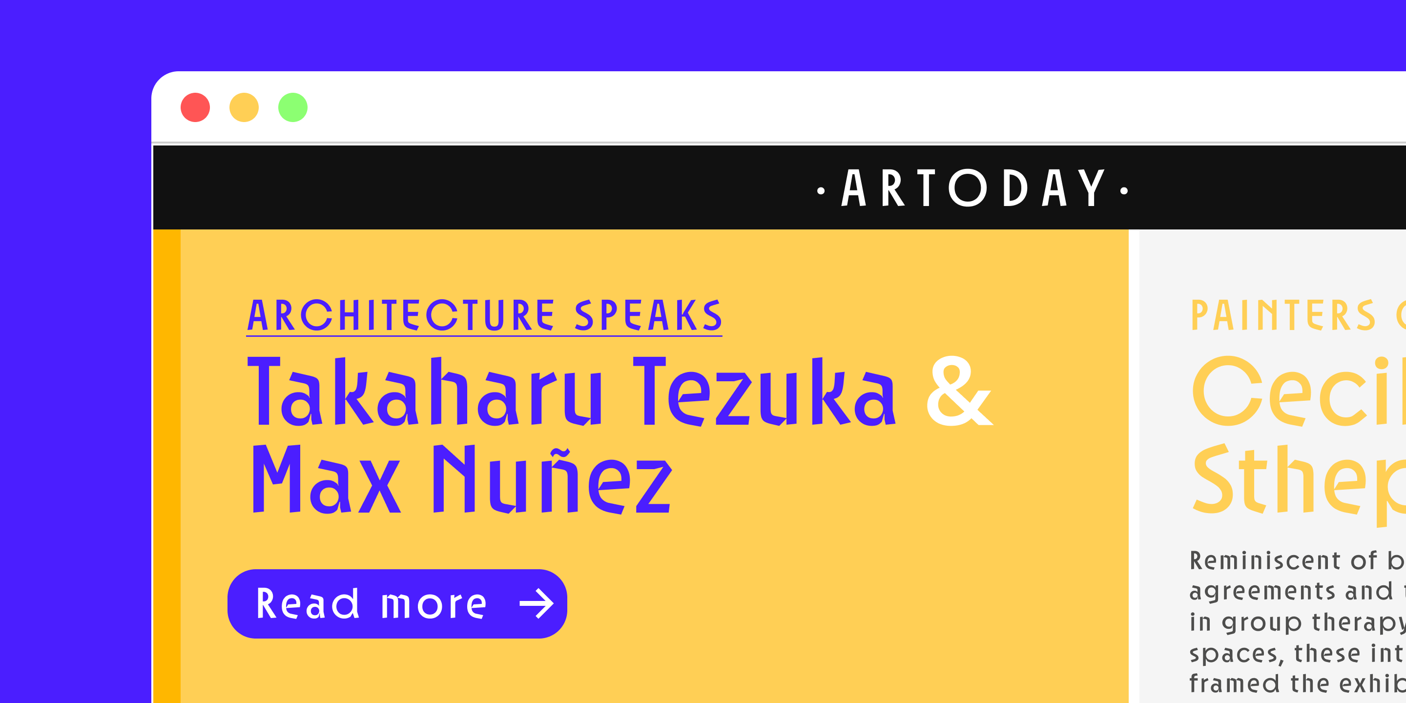
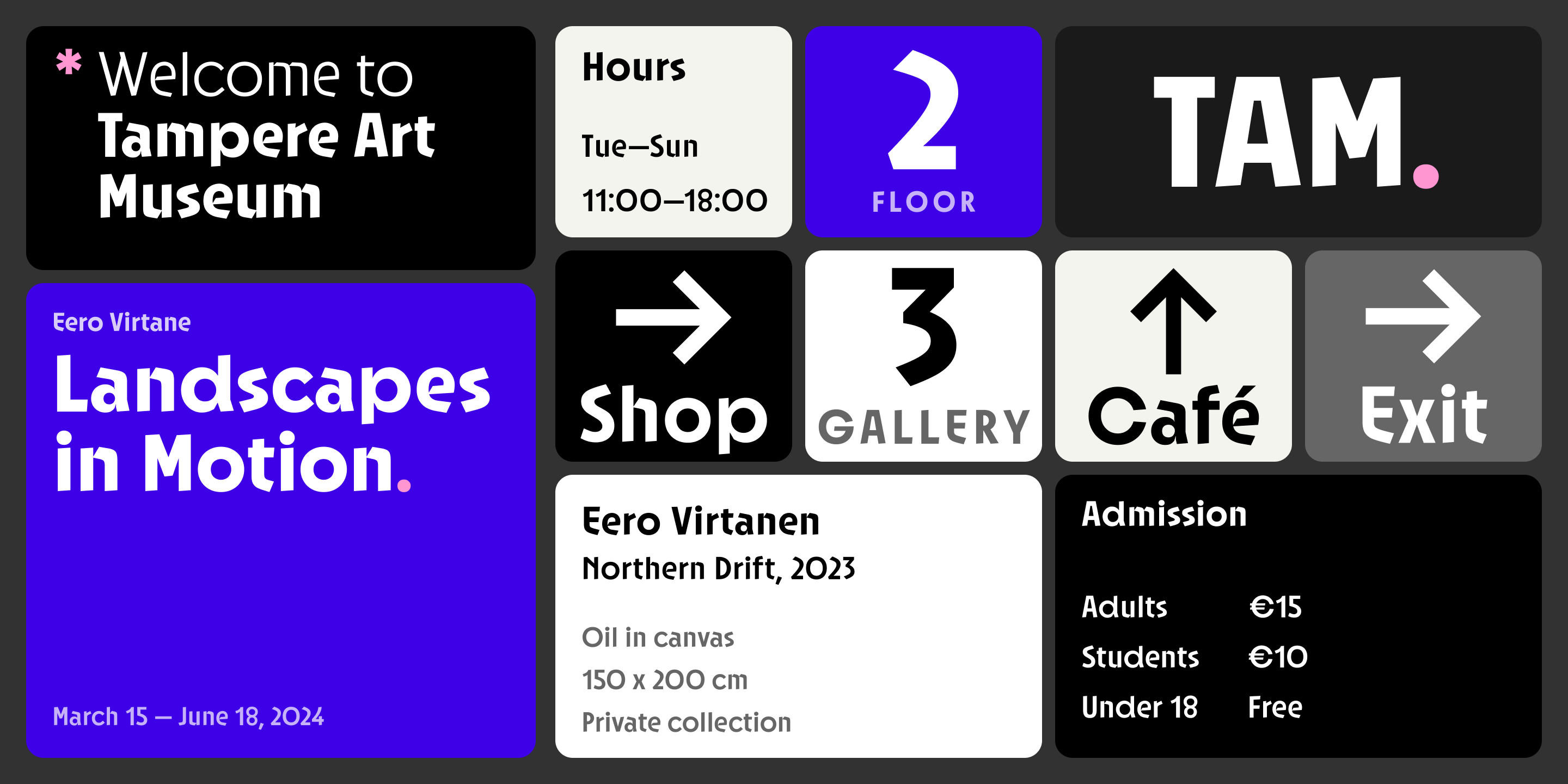
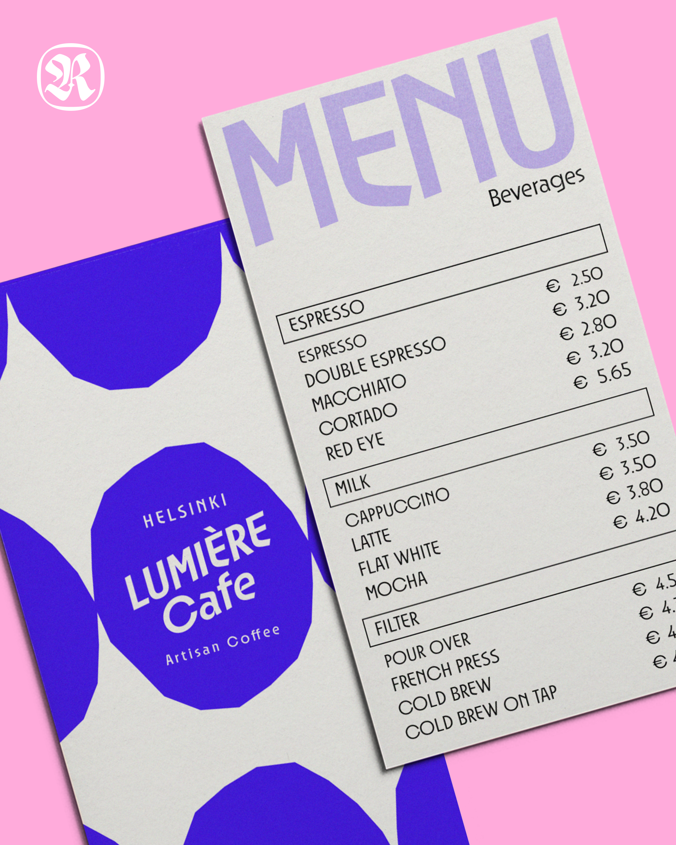
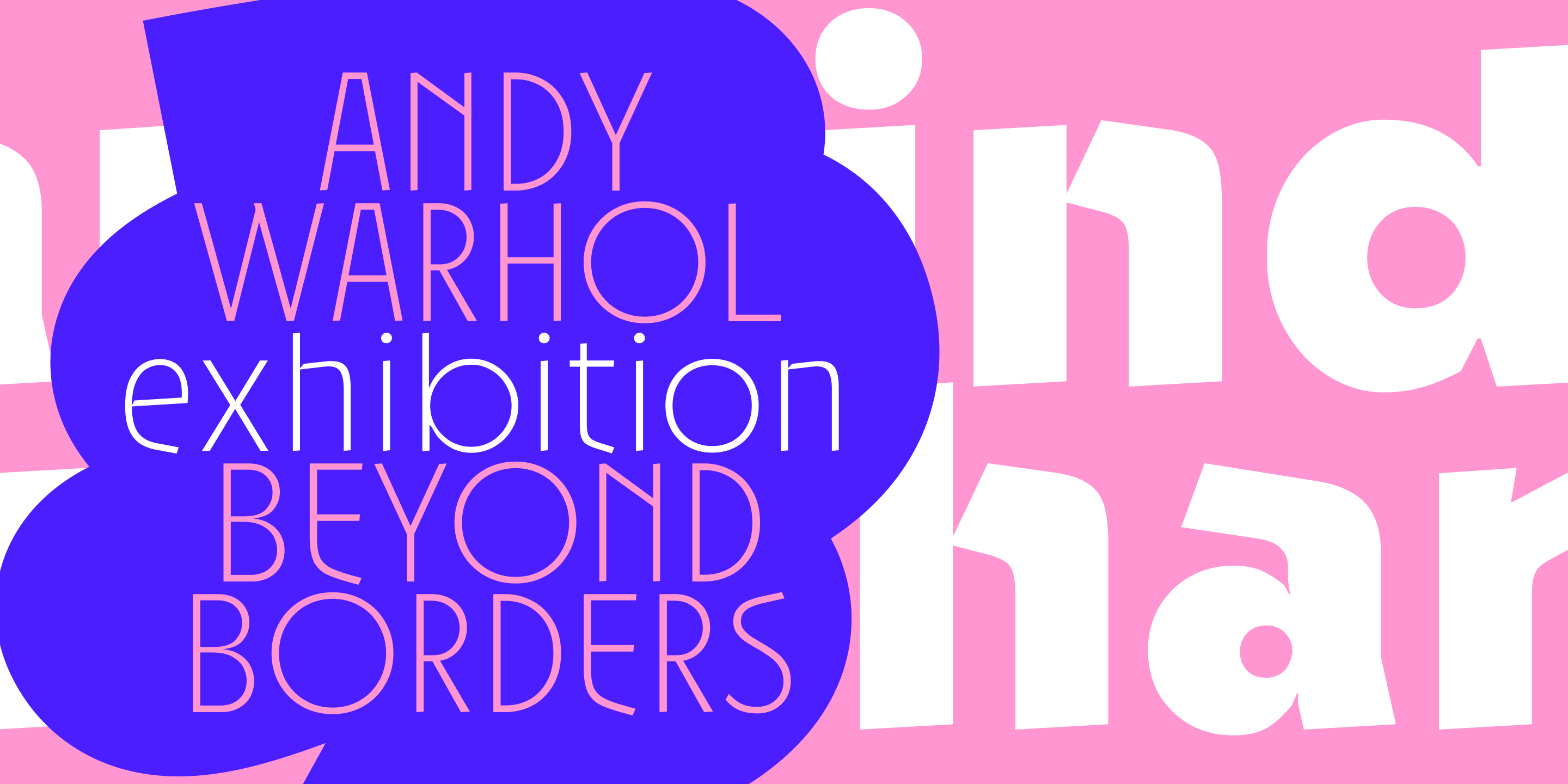
A typeface born from the intersection of Finnish modernism and contemporary graphic culture. Onni's letterforms embrace both function and playfulness — the geometric skeleton of a sans-serif paired with subtle warmth that makes it equally at home in a museum wayfinding system or a café menu in Helsinki.
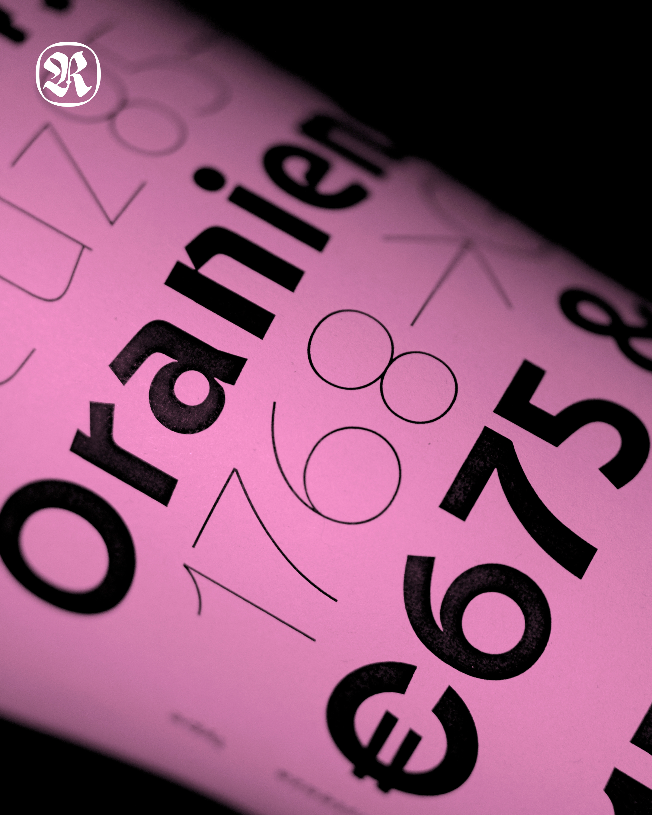
Designed by Resistenza Type, Onni supports Latin Extended and includes 753 carefully crafted glyphs. With OpenType features including ligatures, case-sensitive forms, stylistic alternates, fractions, and full kerning, it performs across editorial, branding, packaging, and screen environments alike.