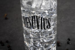
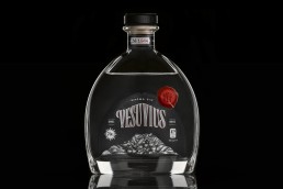
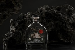
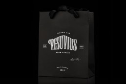
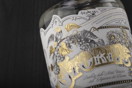
Logo Lettering for VESUVIUS Magma Gin
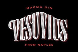
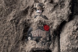
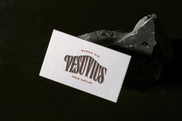
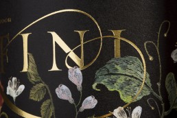
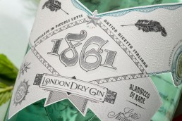
This serif lettering logo is inspired by the distinctive signs and typography commonly seen in local shops throughout the Naples and Salerno area in the 1940s. The name, fittingly, is derived from the iconic volcano, adding a layer of regional identity. The elegant and timeless design reflects the rich cultural heritage of these regions. We carefully chose this specific box shape to complement the serif lettering, ensuring that it fits seamlessly on both the bottle and the label. This attention to detail not only enhances the aesthetic appeal but also preserves the authentic character of the local shop signs that inspired the design, making it a true homage to the area’s vibrant history and traditions.
Type DesignGiuseppe SalernoClientMaurizio De FazioPhotographyDiego De DominicisServicesBrandingYear2019Linkwww.vesuviusgin.it

